
The Coop
Strategic Brand Development
_ Skills + Services _
Naming
Develop Strategic Brand Identity
Web & Graphic Design
Communication & Consumer Education
Signage & Wayfinding
Consumer Journey
Farmers with a vision.
“The Coop is more than just a café, it’s a place to come together and celebrate food, culture and community on the farm at Herban Produce in Chicago’s East Garfield Park neighborhood. A place where those from all walks of life can gather for a good meal made with hyper-local food and recipes inspired by our southern roots.
We pride ourselves on learning from those who came before us, and working towards the future of a food industry with thoughtful stewardship.
Not only are we serving up our own freshly farmed food, but we are also supporting other local BIPOC farmers and food producers so we can all grow together.”
Phase _01
As always, first comes research & ideation. We wanted this brand to not only stand for something but also be full of joy and community engagement. We were inspired by the past and wanted to change the future.
Phase _02
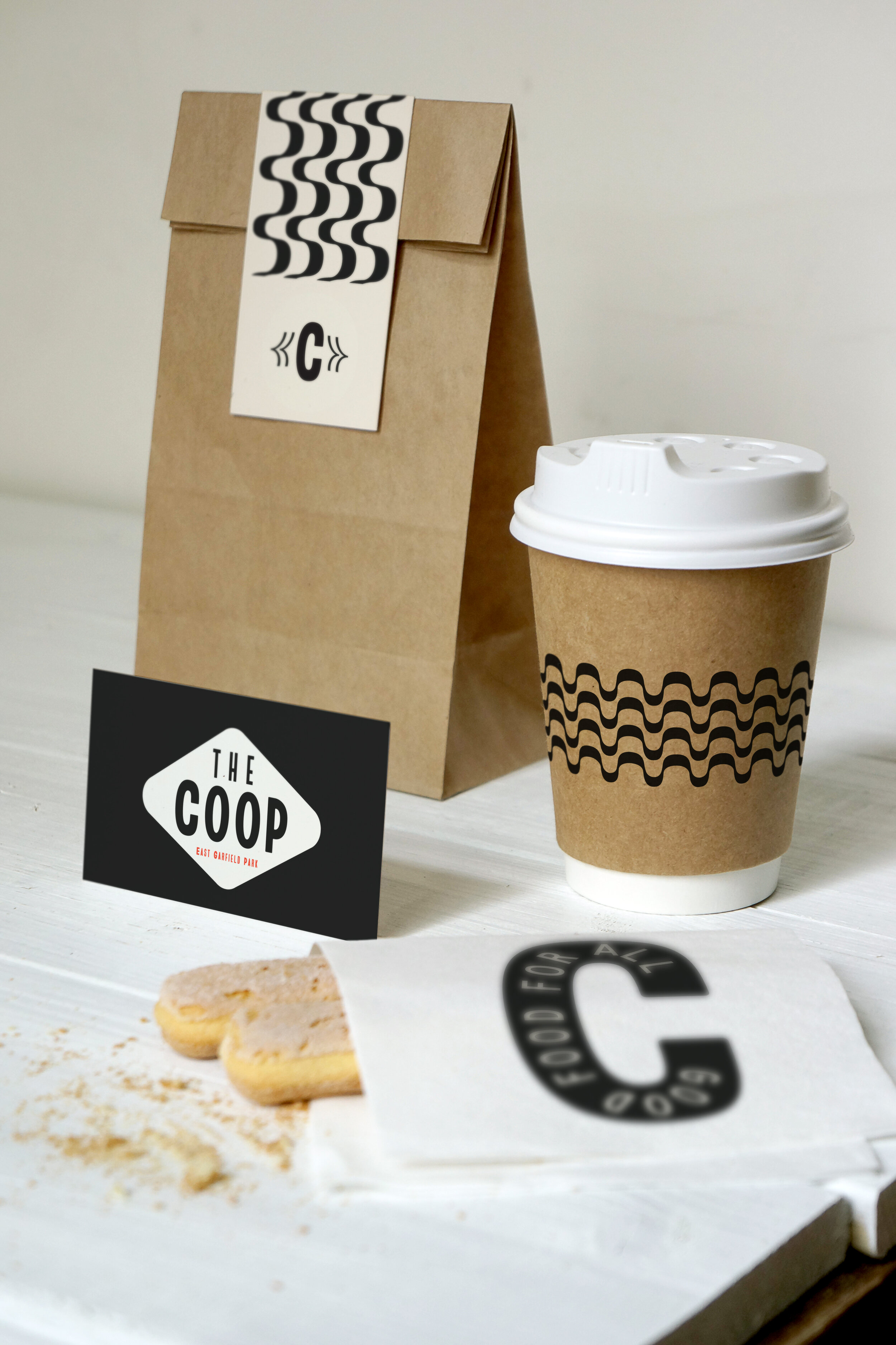
Taking design inspiration from 1960s Civil Rights Poster and similar of-the-time typography - we use primarily black and white, with bold fonts. Type is a little wonky and uneven as though hand stamped or painted on a sign, it’s not too perfect or clean cut.
Bold 60s protest sign style typography, combined with vintage vegetation graphics to tie in the nod to black farmers of the past.
Phase _03
Once we have the brand guidelines established it is time to work on the physical space and hone in on the consumer journey touch points.

* Brand Design
Joyful
Retro
Bold
Warm


_ Business Cards _